
How to define your visual identity
What is Visual Identity?
Visual Identity (brand) is considered one of the most important factors in achieving a successful operation.
It is a set of elements that visually and systematically represent a company, institution or service, conveying values, positions and ideals. As important as being beautiful, the brand must be smart, creative and functional. By balancing these qualities, your company will have a Visual Identity that will help you sell more.
How important is it?
A well-designed and striking Visual identity is a fundamental step to present yourself to your client as a company they can believe in and invest in.
Major players in the market are represented by images and colors that awaken our memory even unconsciously.
McDonalds, for example, is represented by a large M in red and yellow, in addition to the Ronald McDonald character that was also designed in this color palette. It’s impossible not to see one of these elements, whether together or separately, and not immediately remember the brand, even if you don’t want to.
This is the kind of impact you want to make on your audience: a visual identity that shows your mission and becomes recognizable anywhere.
How to make the Visual Identity of my Company?
To assist in this process, we have created a step-by-step guide that serves as a guide. At StudioMAD
we have specialized and dedicated professionals for each stage, check it out!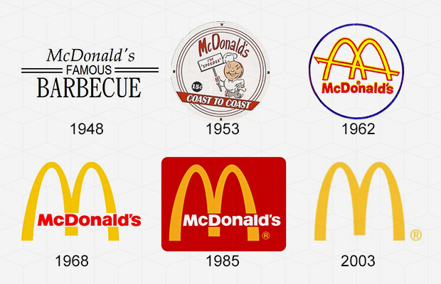
1st Step – Organize ideas by making a Briefing!
The Process for Creating your Visual Identity starts with the Organization of all the ideas that involve the project for the creation of a Briefing. In fact, the quality of the information in this document can be responsible for both the success and failure of any creation.
But what is Briefing?
Briefing is the term given to the set of initial information aimed at producing a Plan that will be used as a guide in Development. It will cover topics such as:
What is your Field of Activity and main products/services?
What are your main competitors?
What is your competitive differentiator?
What is your Target Audience?
Do you have or have you ever used any type of graphic material?
Visual References? Preferred Colors, Style and Fonts?
Step 2 – Make a BrainStorm
With the detailed Briefing, we moved on to the first stage of Creation where we developed BrainStorm.
But what is BrainStorm?
Brainstorming, or as the English translation itself suggests “Tempestade de Ideias”, is a technique used in several areas, “but mainly in those related to creation” where a group of people debate solutions to a problem. It is a search for approaches in which different ideas are collected (from the most sophisticated to the most bizarre).
In the case of projects such as the creation of a company’s visual identity, the technique is quite important to find possible brand models and visual outputs that, according to what has been raised so far, reflect your company’s interests and positions on of your audience.
Step 3 – Set Preference Colors, Styles and Fonts
With everything in hand, it’s time to give shape to everything that has been scribbled so far. Finding the best ways to do this is not an easy task, so it is always important to leave this work in the hands of an experienced professional, after all, it is your company that is at stake here!
But that doesn’t mean you have to blindly trust the team’s work. You need to understand a little of what should be done to be able to better judge the choices and development of the project, so we have listed some points that you can observe regarding the font, color and style of your visual identity.
Source
Serif fonts, composed of strokes and extensions at the end of the letters, convey a message of sophistication and traditionalism, so if your segment is younger and more modern, it might not be a good idea to use one of these. On the other hand, sans serif fonts demonstrate clarity, bringing a concept with more breath and do not match well with more sober business models.
Another important point to take into account is whether your identity will be seen more often on the web or in physical places. If your brand and stationery have greater use in stores and physical commercial outlets, serif fonts tend to read better than sans serif fonts, which are more suitable for the online environment.
Color
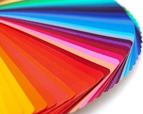
Creating a good color palette for your visual identity is one of the most important and commercially representative jobs for your company. Capable of creating sensations and arousing feelings, colors are quite powerful and, therefore, must be studied before being applied. Each of them represents something different depending on the place and even the time of year. Despite this, there is a base of simpler meanings that can be taken into account when thinking about the best color for your brand. Check out.
-
-
- Red: passion, danger, energy.
- Yellow: light, warmth, optimism.
- Orange: joy, success, vitality.
- Green: health, freedom, hope.
- Gray: neutrality, stability, flexibility
- Black: elegance, formality, strength.
-
Form
As well as colors, shapes also have their distinct meanings that must be explored according to the concepts of that brand. And because they are more than just lines, it is very important that they speak correctly to your company’s values and vision.
Know the symbolisms in advance in a few ways:
- Squares: rationality, impersonality, neutrality and objectivity.
- Circle: absolute, infinite, limitless, timeless and completeness
- Triangle: growth, divinity, harmony and proportion.
In addition to these definitions, there are others for the effects applied to geometric shapes, such as, for example, inclination, which can convey the idea of agility or movement — it is widely used in brands related to transportation or sports.
Ready to get started? Get in touch with our Support Team right now!


